The best rewards programs build loyalty and maintain meaningful, long-term relationships with customers.
It took years of work for big companies like Starbucks and Amazon to build up their rewards programs to be the best in class. But if you’re just getting started or want to improve your rewards program quickly, there are some things you can do to make your program look and work like the best.
Here are five keys to design top tier rewards program that is both engaging and effective.
Promote the Rewards Program Throughout Your Website
Customers won’t know about your rewards program unless you tell them about it. Even the best rewards program can fall short of their potential without a clear promotional strategy. The easiest way to promote your rewards program is to use your website. It’s free, and it reaches customers who are already interested in your brand and may be actively making purchases.
Many ecommerce sites link to the rewards program in the navigation menu and prompt customers to sign up during the checkout process. Both strategies are effective in reaching customers and should be used.
Soko Glam, a beauty brand that specializes in Korean skin care, takes it a step further and promotes their rewards program on the all-important homepage. Their rewards program—Soko Rewards—is still predominantly displayed as the second row, even during Black Friday promotions.
The copy summarizes the benefits of the rewards program and conveys excitement: “Introducing Our Loyalty Program! Redeem Points Earned For Dollar Discounts, Early Sales Access, And Exclusive Gifts (With More To Come!).”
The homepage of any site is reserved for the most important information to capture fleeting attention from users, who often leave web pages in just 10-20 seconds. Soko Glam’s placement of their rewards program on the homepage shows how powerful a rewards program can be.
Encourage Community Without Sacrificing Exclusivity
Rewards programs often have to do two things that seem contradictory: convey a sense of exclusivity and get as many people as possible to sign up. Rewards programs should be accessible and easy to sign up for, yet still deliver special value that can’t be obtained elsewhere.
Of course, the beauty of rewards programs for businesses is that exclusivity is obtained with increased spending. Still, communicating accessibility and exclusivity is a challenge.
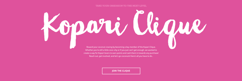
Kopari, which sells coconut oil based beauty products, does it wonderfully by emphasizing both community and uniqueness. Their rewards page welcomes customers to the “Kopari Clique.” A clique takes pride in their own membership. It’s a great word to use to communicate exclusivity and like-mindedness for a rewards program.

To balance out the exclusivity of a typical clique, the copy below the headline emphasizes accessibility and coconuts, which is tied to Kopari’s brand: “Whether you’re still coco-shy or if you can’t get enough, we wanted to create a way for Kopari lovers to earn points and cash them in towards any purchase!” This clique isn’t just for brand advocates—anyone can be a “key member.”
Provide Clear Steps After Sign-Up
Getting customers to sign up for a rewards program is just the first step in engaging them. A rewards program also needs to stay top-of-mind and motivate throughout the customer lifecycle.
Customers are likely to forget a rewards program if they don’t take an immediate action. They’re probably most excited right after sign-up, so provide clear next steps to keep motivation high.
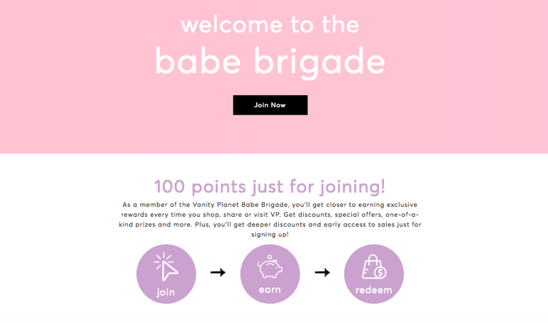
Vanity Planet, a skincare store that sells face brushes and beauty products, awards 100 points to customers who sign up. Customers see this award immediately upon sign-up and have the option to redeem the points. This is a nice way to say thank you. Vanity Planet also gives customers the option to invite friends and earn more points.

A dedicated rewards page, like Vanity Planet’s, allows customers to track their rewards and manage their account. Use this page to welcome new customers into the rewards program and guide them to the crucial next step.
If you’re not sure about what to guide new customers to, test out a few options. You could highlight one powerful incentive, like referrals. It could be even simpler, such as a “start shopping” CTA that leads them back to your catalog, or a “start earning points” CTA that leads them to different rewards campaigns. Track the click-through rates of different CTAs as well as long-term engagement in the rewards program from different first steps.
Offer Multiple Ways to Earn Rewards
The best rewards programs deliver multiple campaigns at the same time. While providing a customized shopping experience is important, it’s very difficult to tell how customers will prefer to earn rewards right off the bat. By offering customers multiple ways to earn rewards, you increase your chances of customers engaging.
Smaller reward milestones, such as social media engagement, can also keep customers motivated in between bigger milestones that take more time to accumulate. We recommend hosting at least five campaigns.
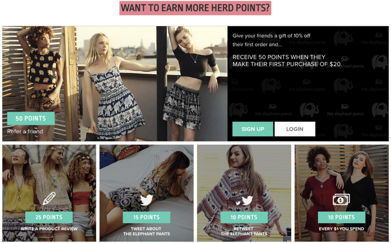
The Elephant Pants gives customers several ways to earn “herd points.” Customers can earn points by referring a friend, writing a product review, making purchases, celebrating a birthday, creating an account, and engaging with the Elephant Pants on social media.

The design also looks pretty and clean, which always helps. The Elephant Pants takes advantage of the space to show off more of their product and makes the page look like a fashion catalog.
The Elephant Pants’ campaigns cover the five main types of rewards campaigns:
- Website engagement (creating an account, reading a blog post)
- Social media engagement
- Feedback
- Referral
- Purchases
For many products, referral programs are the most powerful and cost-effective way to attract new customers. It makes sense for the Elephants Pants to highlight this action over the other campaigns.
Ultimately, different incentives work best for different brands, and it’s worth experimenting to see what your customers will respond to.
Explain Your Rewards Program with Clear Language and Images
The best rewards programs are easy to understand and use. Customers should not be confused about what their rewards are, how to redeem rewards, or what to do next. Use clear language, along with images and graphics, to explain how your rewards program works and spark excitement for customers to get started.
Most customers will probably be familiar with the concept of rewards. When explaining the basics of a referral program, there’s no need to reinvent the wheel. Spend more time with the particularities of your program and any restrictions or limitations that may apply.
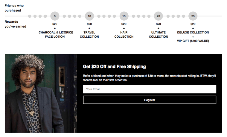
Scotch Porter, a brand that sells men’s grooming products, states the main benefit of their referral program in the headline of their rewards page: “Give $20, Get $20!” They use the rest of the copy to explain the qualifications of the reward—referred customers have to spend $40 or more—and benefits that may be unexpected—both parties also receive free shipping in addition to the $20 credit.

Scotch Porter also uses a simple graphic to show that customers can “level up” with more referrals. Not only will they get the monetary reward with each referral, but they’ll also get special products with every five customers referred.
Apply Best Practices to Your Rewards Program
Effective rewards programs focus on ease, flexibility, and excitement. Like any good product, rewards programs encourage habit formation and keep customers coming back for more.
While the specifics of your rewards program (incentives offered, copy, promotional strategy, etc.) will vary and require testing, these five best practices will help you design a rewards program that resembles the best ones out there.


