In one of our recent blog posts we covered the Nordstrom rewards program in detail, discussing how the retail giant successfully built and executed their program. Nordstrom’s launch was highly successful and unsurprisingly they’re not the only major brand to have reaped the benefits of customer loyalty. GAP, Starbucks, Marriott, JCPenney, and many others are focused on building bases of reliable customers more than ever.
We took some time to study the rewards programs at several of these companies and a few things stood out to us right away. As you can imagine, the programs themselves were extremely diverse. Each store had different goals in mind, which was reflected in the programs they implemented. There were variations based on industry, target demographic, and countless other nuances making each program truly unique. By the end of our investigation, we noticed one major similarity amongst the rewards programs of all of these giants. That commonality was what we like to call a “rewards page”.
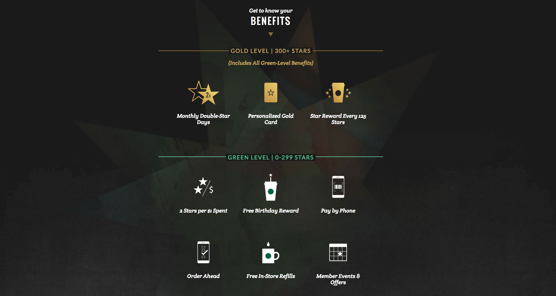 A screenshot of a section of
Starbucks' rewards page
Every program used a dedicated page (or several) in order to explain and house their rewards program. These rewards pages allowed customers to fully interact with the programs and are integrated masterfully with the brands they represent.
The popularity of rewards pages amongst major companies is no new discovery. Creating these rewards pages has actually long been a possibility with Swell using our API and SDK. This feature gives Swell users access to all the tools and information they need to build a custom rewards page specifically for their store -- something which we do on our Platinum and Enterprise clients' behalf as well.
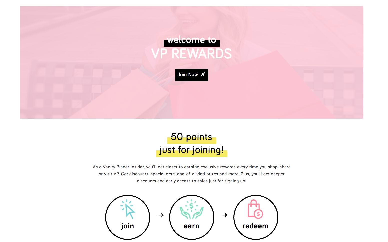 Screenshot from
Vanity Planet
The end result, such as the example above, is a beautiful extension of our clients' brands. However, we also realize that the process is a time and resource-consuming one.
Using the API and SDK to construct a custom page undoubtedly produces a superior final product, but requires technical knowledge and resources to implement. This is not a problem for stores with access to agencies or developers. For other stores though, we understand that these kinds of resources aren’t readily available or don’t fit within their priorities.
Swell’s new “rewards page” template was designed specifically for stores that are looking for a more sophisticated rewards program implementation, but maybe don’t have the time or resources to build a page using our API documentation.
So what exactly is this new rewards page?
The rewards page feature takes all the aspects of the rewards popup, and injects them into a sleek, flexible, and fully customizable page put together by our very own design team. The setup process requires absolutely no coding, and the page can be taken live within minutes of installing.
However, for most merchants looking for a solution like our rewards page template, the final look of the page is even more important than the setup process. Those of you concerned about the look of the final product probably have one question in mind:
Am I going to get a generic, cookie-cutter page?
Absolutely not. One of the most exciting things about the rewards page, is the versatility of the design. We've given our merchants all the options they could want to make the page truly match their brand. Better yet, all of those options can be deployed within minutes.
We put together a few "themes", which we recommend you use as a starting point when designing a page of your own. Once you’ve chosen one of our defaults (or a blank page) you’ll have the chance to begin customizing the page to your liking. You’ll quickly find that the options are truly plentiful.
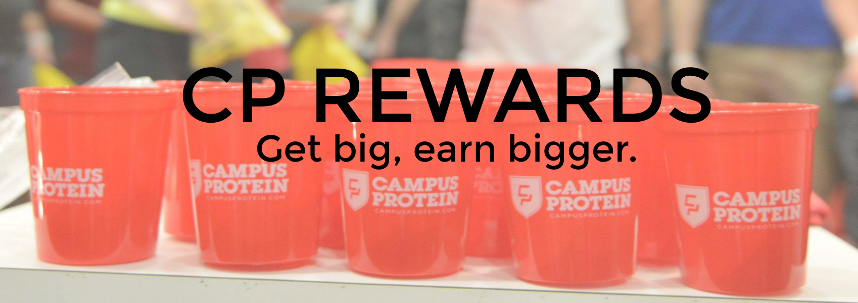 Screenshot from
Campus Protein
Here's a quick look at all of the customization options you'll have with your rewards page:
Header image: In addition to choosing from one of our default header images, you’ll also have the option to upload any image you’d like as the header for your rewards page. Any style ranging from a single high quality image to a repeating pattern can be utilized, depending on the feel of your website.
Background pattern: In addition to the header image, we also allow you to choose a repeating pattern to upload in the background of your page. It will be slightly transparent and adds a bit of texture to the page.
Colors: Instead of giving you a single color option to try and match the overall theme of your site, with the rewards page we’ve given you the option to modify the color of each of the individual sections within the page. For example, you have the flexibility to create an alternating pattern, a more consistent color scheme, or anything in between. The choice is yours.
Text: Like with the rewards popup, all of the frontward facing text in Swell can be edited. You’ll also be able to completely edit the FAQs section to fit the specifics of your program if need be. We want the program to take on the look and feel of your website and in order to do that, it’ll need to take on the right language as well.
Fonts: Swell gives you the ability to upload any font present on your website into your rewards page. The font size of the blocks of text is also completely customizable, allowing you to make small tweaks to make the design a seamless addition to your store.
Program: Of course, you’ll get Swell’s trademark program customization as a part of the rewards page as well. You can choose any of our numerous ways to earn points and spend points, and choose to describe them however you’d like.
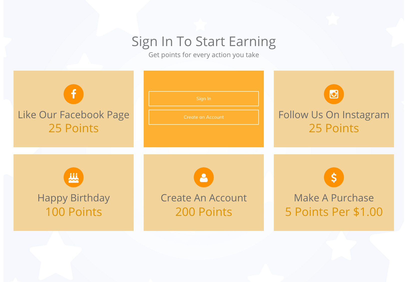 Screenshot from
Fabric Wholesale Direct
The rewards page is easy to setup, customizable and well-designed; however, it's also a much different solution than the "rewards popup" that many of our merchants are accustomed to. So if the popup gets the job done, why go through the effort of downloading and designing the page?
What value does a rewards page give me that a popup doesn't?
As a brand, your goal is to get your customers excited about more than just your products. You want them to “buy in” to everything your store represents. This means aiming to make sure customers have a positive experience with your store and are excited about coming back.
To that end, one of the most important aspects of a high-performing loyalty program is ensuring that the customer has a positive experience when interacting with it on your storefront. The more seamless the experience, the more customers will view a program as a core facet of your brand...and the more they'll want to buy from you again!
Simply put, the feel of a tab and popup on a web page is just plain different from the feel of a dedicated page. A program that is explained and outlined in a dedicated and well-designed page is going to be viewed as a more integral part of the customer experience than a small tab. While the rewards popup undoubtedly works, merchants who are looking to fine-tune and optimize their customers' experience have found that a dedicated page is the superior solution.
How can I get the rewards page?
As we described earlier, Swell’s rewards page was designed for merchants interested in a more sophisticated rewards program, but who also aren't quite ready for our Platinum plan (or to build out a page on their own). For this reason, we’ve made the customizable rewards page open to all merchants on our Gold plan and above.
Once you decide to upgrade, you’ll be able to download the page from the “Rewards Page” section of your Swell account and easily add it to your website. The process is designed to be as quick and simple as possible, while still giving you the ability to design a page that fits seamlessly with your website.
For many of our merchants, setting up a beautifully-designed rewards page is the "next step” in the growth and evolution of their businesses. It makes for an incredibly seamless on-site experience for your customers, and will add to the perception they have of your brand as a whole. With our new rewards page template, taking the next step in your store's journey is fast, easy, and accessible.


